CSS Standards and Normalization Part 4: Style Tutorial
12 Mar 2018 | Josh BolandPurpose
The purpose of this series will be to define some standardized best practices for how CSS is composed and organized in our projects.
This is part 4 of 4: Style Tutorial. In this article, we will walk through a guided example that puts into practice our CSS philosophy. The goals of this tutorial are:
- Show how to identify different types of CSS rules
- Show how to identify and write styles for components
- Provide working examples for implementing BEM naming
- Show how to use Bootstrap to support development
Tennessee Coastal University
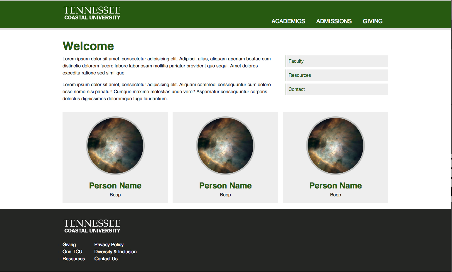
For our tutorial, we’ll build a simple landing page for the fictitious Tennessee Coastal University. They’d like you to use the Up&Up CSS standards during your development (surprise!)
Here is what the final product will look like. Use this image for reference as you follow along.
Setup
To get started, clone this git repository wherever you will be building the site. Your clone location will differ depending on your local setup. Since No php is involved, you could even place it in a directory somewhere and open index.html in a browser.
The master branch contains the finished version of the site.
Go ahead and run git checkout tutorial-start to move to the tutorial start branch, which is set up to follow along with these instructions.
After checking out the tutorial start branch, run npm install from the root directory.
This will install bootstrap, node-sass and other dependencies for you. If you do not have npm (or node.js) configured, follow these instructions.
Once the npm modules are installed, take a look at the folder and file structure. Your basic file structure is already established with a some of the files in place.
Go ahead and compile the SASS that exists by running npm run sass in the terminal.
Refresh the page, and you should see some minimal styling.
Setting up Bootstrap
At this point, the page has very little structure to it. To set up the grid and provide basic page structure, we need to include bootstrap.
Open your main.sass file and add the following line beneath the “Include Bootstrap” comment
@import '../../node_modules/bootstrap/scss/bootstrap'
This will import the bootstrap framework into the stylesheet build.
Now, you can run npm run sass again and refresh the page to see the changes.
So you don’t have to continually run the npm run sass command to compile sass, a watcher script has also been included in the project.
Running npm run watch will monitor the sass files and re-build the css output as the sass is updated.
Modifying the max-width for the Bootstrap grid
One modification we’d like to make to Bootstrap’s default setup is to increase the maximum width of the container elements at the largest breakpoint.
If you look at the markup, you’ll see class="container" in a few different places. The container class is used to limit the maximum width of the element to which it is applied.
Bootstrap’s variable that is used to control the max with of container elements at different screen sizes is called $container-max-widths.
Inside this variable (which is a Sass map), different breakpoints are given different maximum widths using a key: value structure.
Here’s how the variable looks inside of Bootstrap.
$container-max-widths: (
  sm: 540px,
  md: 720px,
  lg: 960px,
  xl: 1140px
)
So, at the small breakpoint, the elements with the container class are limited to 540px at most.
We just want to override the last value, the maximum width for the largest breakpoint.
Open the _bootstrap_variables.sass file in css/src and add the following line:
$container-max-widths: (xl: 1200px)
This will set the max-width at the xl breakpoint to be 1200px. If you’d like to see what other Bootstrap variables are available to override,
you can see the full list in the node_modules/bootstrap/scss/_variables.scss file. The Bootstrap Themeing Guide
also discusses customizing Bootstrap by re-defining Sass variables.
To complete the override, we need to import the _bootstrap_variables.sass file into main.sass.
Open main.sass and above the line where bootstrap was imported, add the following line:
@import 'bootstrap_variables'
Let’s get basic
Now its time to determine what base-level styles we need to put into place. Bootstrap already includes some “CSS Reset” code, so we won’t need to worry about any style resets. Looking at the final output, there are a couple of things that we can style globally: type styles and colors.
Defining some variables
Since we are using Sass, we’ll want to define our colors as variables so that they can be re-used across other Sass files.
To do this, add a file in css\src called _variables.sass. Inside the variables file, define the following color variables:
$brand-green: #255b0b
$brand-grey: #252624
$brand-grey-light: #c0c1bf
$brand-grey-lighter: #DEDEDE
$brand-grey-lightest: #EEEEEE
To make these variables available in our other SASS files, include this _variables.sass file in main.sass just below where bootstrap was imported.
@import 'variables'
Setting up type styles
Tennessee Coastal’s brand font is Helvetica, they would like the whole site to be set in Helvetica.
To achieve this, lets add a file for typography in the css\src\base\ folder, called _typography.sass.
To set the page to use Helvetica everywhere, we can add a font-family rule to the body element inside this file.
body
    font-family: Helvetica, sans-serif
The typography file is also the best place to configure the general type styling for the headline elements. Let’s set up any headline elements to use the brand green color, be bold and have a small margin bottom. These styles should apply in MOST cases when headlines are used. In cases where we want to alter the default headline styles, base styles can be overridden by a component.
//sass-lint:disable single-line-per-selector
h1, h2, h3, h4, h5, h6
    font-weight: 600
    color: $brand-green
    margin-bottom: 0.5rem
Additionally, let’s make h1 elements a bit larger than they are by default
h1
    font-size: 2.5em
Handling Layouts
Now that we’ve established some base styles, we need to identify our major layout sections on the page. Layout sections are the sections of the page that give it large-scale structure. Layout sections are usually visible everywhere across a site. There is some level of subjectivity in identifying layout sections, but typically, there are at least 3 in most sites.
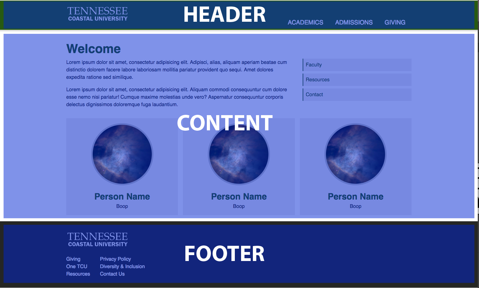
Some styles have already been added for the content area, so we will focus on adding styles for the header and the footer.
The header
The header already has a bit of structure to it, thanks to Bootstrap’s container class. What we need to do now is add some styling to get the logo and nav in the right places as well as provide a bit of color.
First, take a look at the markup for the header in index.html.
<header class="layout-page-header">
    <div class="container">
        <div class="layout-page-header__inner">
            <div class="logo logo--header">
                <svg class="logo__svg">
                    <use xlink:href="/svg/tcu.svg#tcu" href="/svg/tcu.svg#tcu"></use>
                </svg>
            </div>
            <nav>
                <ul>
                    <li><a href="#">Academics</a></li>
                    <li><a href="#">Admissions</a></li>
                    <li><a href="#">Giving</a></li>
                </ul>
            </nav>
        </div>
    </div>
</header>
You’ll see some BEM syntax used in the classes layout-page-header (the block) and layout-page-header__inner (an element in the page-header block).
To add some color to the header, we’ll style the layout-page-header class. Let’s create a new file called _layout_page_header.sass inside css\src\layout\.
Notice that the file name matches the class name.
This is important as it helps us be able to quickly determine where an element’s styles are stored just by looking at the class name.
Go ahead and import this file into your main.sass file.
Inside the _layout_page_header.sass file, add the following styles to style the header.
.layout-page-header
    background: $brand-green
    border-bottom: 5px solid $brand-grey-lighter
    padding-top: 1em
The layout-page-header__inner class is what we will use to get some positioning for the logo and the nav, with the logo on the left and nav on the right.
Adding some flexbox styles should accomplish that.
.layout-page-header__inner
    display: flex
    justify-content: space-between
The footer
On to the footer! Have a look at the footer markup in index.html
<footer>
    <div class="container">
        <div class="logo logo--footer">
            <svg class="logo__svg logo__svg--footer">
                <use xlink:href="/svg/tcu.svg#tcu" href="/svg/tcu.svg#tcu"></use>
            </svg>
        </div>
        <div class="footer-lists">
            ...
        </div>
    </div>
</footer>
We’ve left off classes from the footer. Your job is to add one class to the <footer> element and set up some styles (in the correct place) to match the image at the beginning of the article.
Now, give it a go, see if you can style that footer!
(Hint, it uses $brand-grey)
…
How was it? Not too bad right? Here’s what we recommend doing.
Add a layout-page-footer class to the <footer> element.
<footer class="layout-page-footer">...</footer>
Create a new _layout_page_footer.sass file in css\src\layout. Inside that file, add some styles to style the footer.
.layout-page-footer
    background: $brand-grey
    padding: 2em 0
Bootstrap’s role in layouts
Outside of our 3 main layout sections, there are certainly other parts of a website that will need some layout-driven CSS rules. One example of a common layout need is a grid system. That’s where Bootstrap comes into play for us.
Inside of our larger containers, we rely on the Bootstrap grid system to give structure to a page.
Taking a look at the markup, you can see that the body copy and sidebar are arranged using the Bootstrap grid classes.
Additionally, the contents of our 3 main layout sections are all wrapped with a container class, which limits their width.
Any place you need column-based layouts, you should use Bootstrap’s grid system.
Identifying components
Components make up the majority of the styles for a page and are what you will spend the most time on when building a site. The first step in writing component styles is to identify what the components are. Components are parts of the page that we want to treat as separate units. They are not styled in a context-dependant manner (meaning they can be moved around and retain their styles).
In our sample layout, there are 5 components that we can easily identify.
- Logo
- Primary Navigation
- Sidebar Navigation
- Faculty Profile Card
- Footer List
We will focus in on adding styles for the primary menu and for the faculty profile cards.
Primary Menu
The primary menu component is located in the header and contains the primary navigation items. We will need to handle a few things in this component.
- Align the navigation list with the bottom of the header
- Show the individual navigation items inline
- Style the navigation links
There is already markup in the index.html file for the menu and an empty _primary_menu.sass file can be found in css\src\components.
Lets start by looking at the markup.
<nav>
    <ul>
        <li><a href="#">Academics</a></li>
        <li><a href="#">Admissions</a></li>
        <li><a href="#">Giving</a></li>
    </ul>
</nav>
Our first step is to identify the block (The B in BEM). That’s going to be the <nav> element.
Since we are calling this component “Primary Menu”, we’ll add the primary-menu class to the <nav> element.
<nav class="primary-menu">...</nav>
Now, we want to identify sub-parts of the block (Elements - the E in BEM) that have their own styling needs.
It’s likely that we’ll need to style the <ul> element and the individual <li> elements. Now we need to choose names for these.
Be concerned more with clarity over being too verbose. Something like primary-menu__list and primary-menu__item should work well.
The format for BEM dictates that elements are named with their block name, then 2 underscores, then the element name. The markup should now look like this:
<nav class="primary-menu">
    <ul class="primary-menu__list">
        <li class="primary-menu__item"><a href="#">Academics</a></li>
        <li class="primary-menu__item"><a href="#">Admissions</a></li>
        <li class="primary-menu__item"><a href="#">Giving</a></li>
    </ul>
</nav>
The markup is complete, let’s move into the SASS file and add some styles.
Our first concern is to get the individual nav items to show in a single row as opposed to a standard stacked list.
Our approach will be to use the primary-menu__list class to accomplish this.
.primary-menu__list
    display: flex
    margin: 0
    padding: 0
    list-style: none
Secondly, we want to style the anchor elements that make up the nav. These are <a> elements inside the <li> elements with the primary-menu__item class.
Some developers may desire to add a class like primary-menu__link to the <a> elements directly here, and that is OK.
However, since the <a> is the only child of the primary-menu__list elements, using the following styles is also suitable.
.primary-menu__item a
    display: block
    padding: 0.5em 1em
    color: #ffffff
    text-decoration: none
    font-weight: 500
    font-size: 1.2rem
    transition: all 0.5s
    text-transform: uppercase

    &:hover
        background: $brand-grey-lighter
        color: $brand-grey
Lastly, we want the list to be aligned with the bottom edge of the header. This we can do by styling the block, using the primary-menu class.
A simple flexbox layout will take care of this.
.primary-menu
    display: none
    flex-direction: column
    justify-content: flex-end

    @include media-breakpoint-up(md)
        display: flex
Media Queries!
A point of note here. Check out the way breakpoints are included. media-breakpoint-up(size) is a bootstrap mixin.
We prefer to define any media queries by using mixins in the component file itself.
Using this approach keeps ALL styles related to a component in one place.
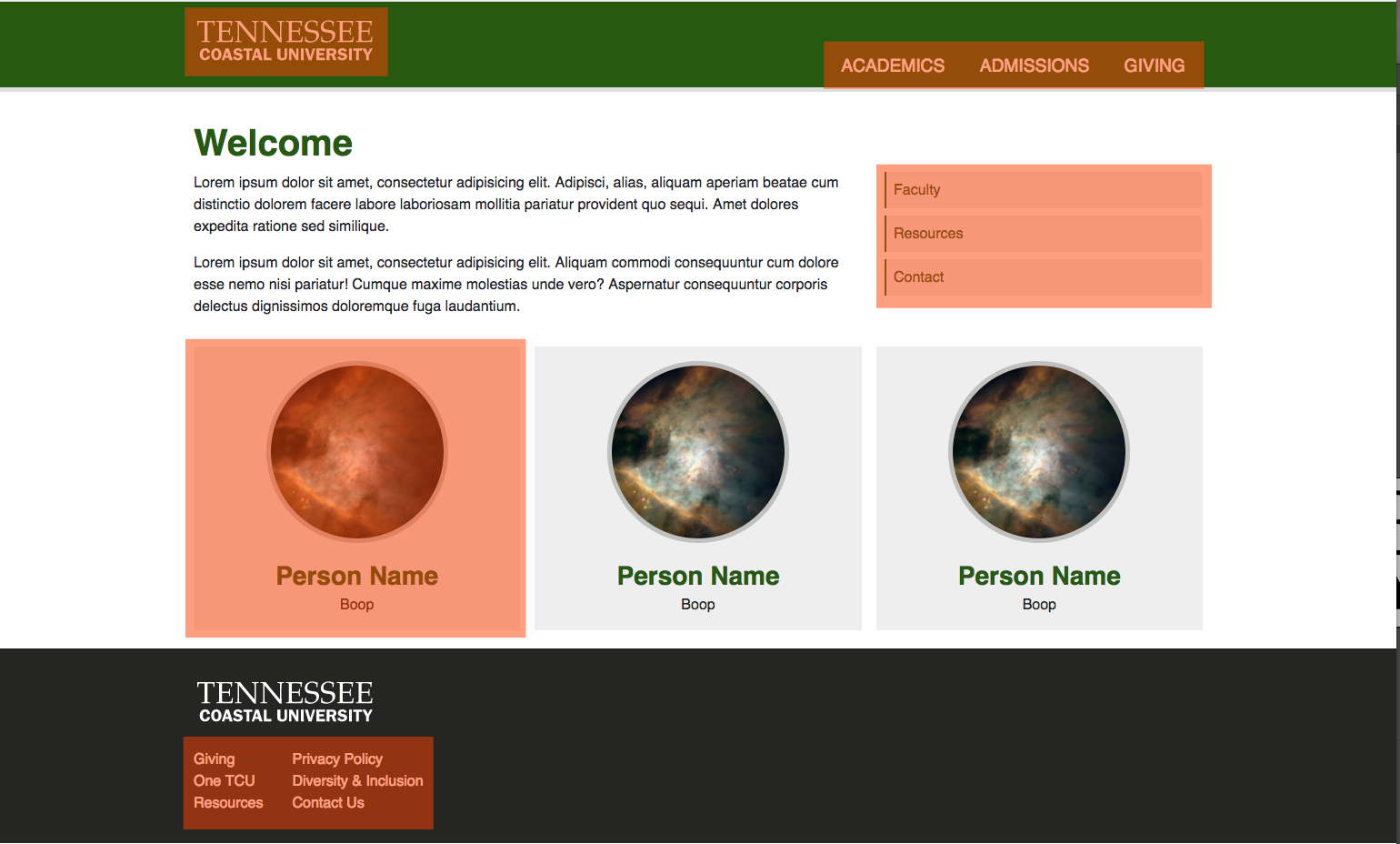
The Profile cards
Time for the test! The tutorial branch has omitted the classes and styles for the faculty profile cards component.
Hre’s the beginning markup:
<div>
    <div>
        <img src="https://spaceholder.cc/300x300" alt="a person!"/>
    </div>
    <div>
        <h3>Person Name</h3>
        <p>Boop</p>
    </div>
</div>
Try using what you have learned to write some BEM class names and styles for this component. Remember, identify the Block and then identify the Elements. Add classes to your markup, write your styles and tweak as needed.
…
…
…
How’d you do? Below is one method of building this layout. If your styling approach or class names are not the same, that’s OK. Do evaluate, however, how you did with your BEM naming!
Markup (for one card):
<div class="faculty-card">
    <div class="faculty-card__photo-wrap">
        <img src="https://spaceholder.cc/300x300" class="faculty-card__photo" alt="a person!"/>
    </div>
    <div class="faculty-card__text">
        <h3 class="faculty-card__headline">Person Name</h3>
        <p class="faculty-card__about">Boop</p>
    </div>
</div>
Styles:
.faculty-cards
    display: flex
    flex-wrap: wrap
    margin: 0 -.5em
    margin-bottom: 1.25em

.faculty-card
    min-width: 30%
    flex-grow: 1
    padding: 1em
    margin: 0 0.5em
    background: $brand-grey-lightest
    margin-bottom: 1em

    @include media-breakpoint-up(lg)
        max-width: 33%
        margin-bottom: 0

.faculty-card__photo-wrap
    width: 200px
    height: 200px
    margin: 0 auto
    border-radius: 50%
    overflow: hidden
    margin-bottom: 1.25em
    border: 5px solid $brand-grey-light

.faculty-card__photo
    display: block
    width: 100%
    height: auto

.faculty-card__text
    text-align: center

.faculty-card__headline
    margin-bottom: 0.1em

.faculty-card__about
    color: $brand-grey
    margin-bottom: 0
Go and build!
We hope this tutorial was helpful. As you learn and try this out, please ask questions!